Energy Reduction Dashboard Design
09/2023
Role -> Design & Interaction Lead
Design Team -> Sarah Shatto, Haley Jacobson
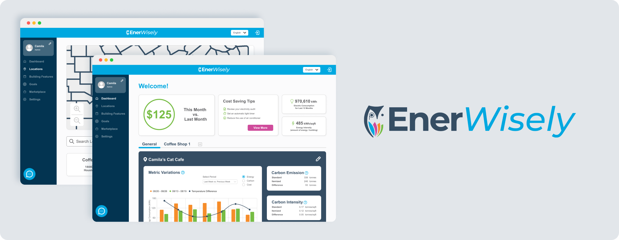
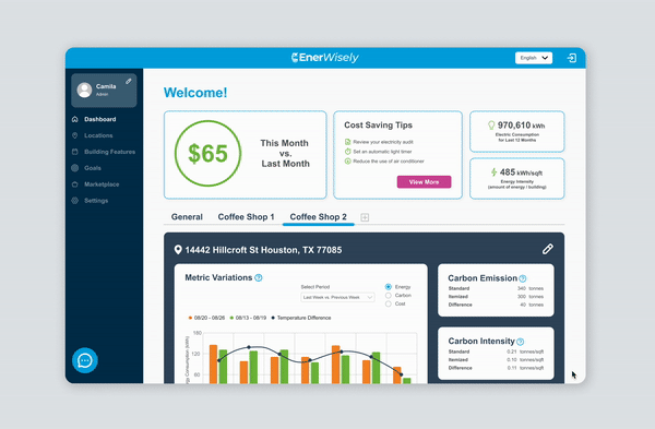
Quantum New Energy is a Houston-based technology company that provides a sustainability platform. They have a product called Enerwisely, which allows the residential users to monetize their carbon reduction. Quantum New Energy is currently expanding this product to include a commercial dashboard version for businesses to manage their energy usage across multiple locations
Enerwisely was at the stage of launching the pilot program for certain users. Our team developed the current onboarding and dashboard experience to align with Quantum New Energy’s mission, reducing energy costs and carbon emissions.
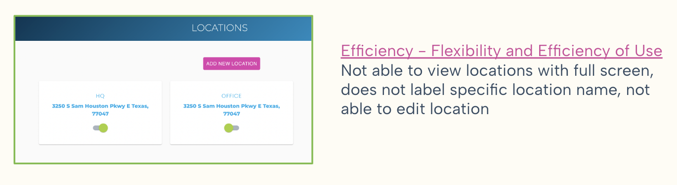
Our team had an opportunity to participate in launching the pilot program to potential users. During this launch, we observed that users were confused with the onboarding and needed to spend time to understand data on the dashboard due to unclear instructions and the lack of information hierarchy.
How can we make the platform easy to use and improve the legibility for the data on the dashboard?
Create commercial dashboard for future potential for B2B2C white labeling.
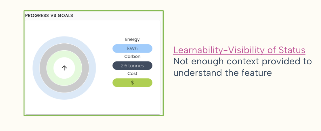
We evaluated the interface of the residential dashboard to incorporate the findings in the commercial dashboard. Some of the highlights are violating the learnability of the information due to the misuse of UI elements and also the efficiency of use, such as not being able to view the map in full screen and lacking an informational hierarchy.

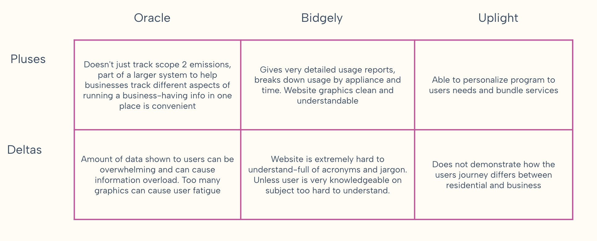
These competitors offer services similar to our app in terms of substantial energy reduction:
- Oracle
- Bidgely
- Uplight
Pluses and Deltas:
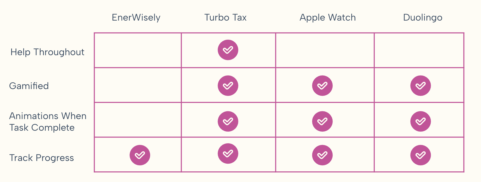
Feature Inventory with Comparators
For our comparator analysis, we focused on how other apps motivate users to continue completing a task or achieve a goal. We found that they use various visuals, such as animations and mascot, and to gamify and track the progress.
- Turbo Tax
- Apple Watch Ring
- Duolingo
We conducted user interviews with business owners, property managers, project managers, and individuals interested in sustainability to gain insights into their learning styles, motivations, task organizations, engagement with sustainability.
"Organization is so important. There's so many things you are juggling you don't want anything to slip through the cracks."
"Having some sort of information that shows you how what you are doing is actually impacting the environment in a certain way is really helpful."
"I wouldn't say I really celebrate achieving my goal. I just like the accomplishment of removing it from my to-do list."
We discovered that people are willing to learn more about sustainability, but they encounter some barriers like the difficulty level of terminologies and making a connection with how it would affect themselves in order to take actions.
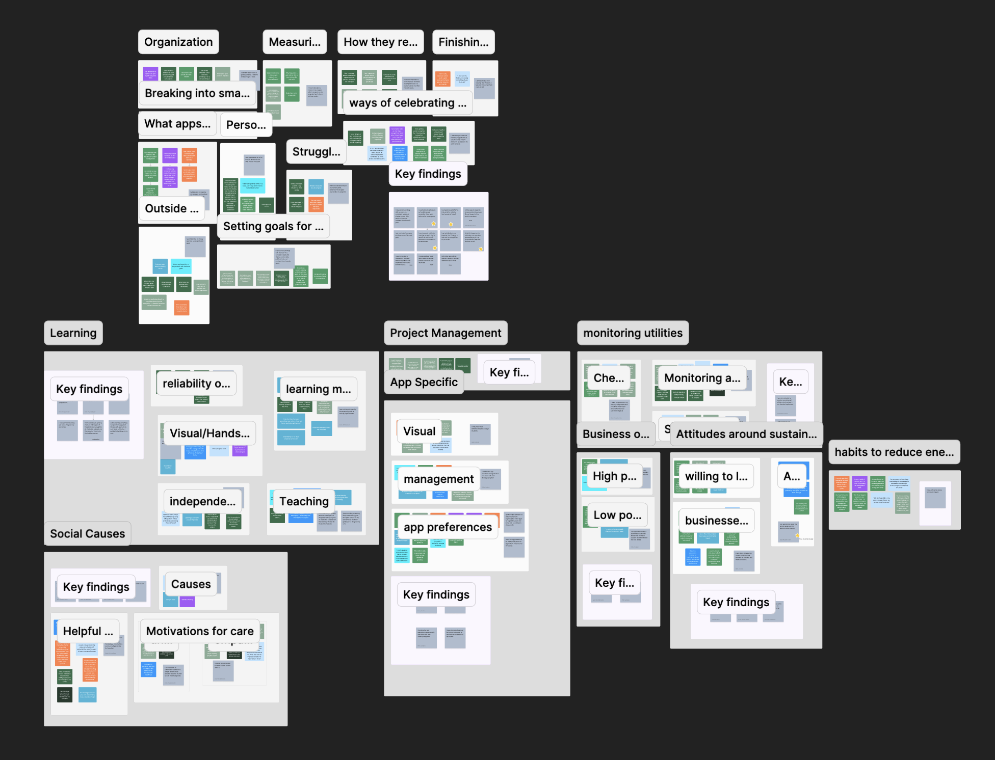
* Affinity Map Progress
We discovered that people are willing to learn more about sustainability, but they encounter some barriers like the difficulty level of terminologies and making a connection with how it would affect themselves in order to take actions.
- Users feel empowered and confident when learning new things, and learn best through visual and interactive elements.
- Users care generally about social causes, but need to feel connected to a cause in order to take any action and can sometimes feel discouraged about their ability to make change.
- Users value customization and the ability to build or expand functionality when needed.
We noticed that both Camila and William are visual learners, have goals for saving money, and manage multiple locations. However, these different personas include both individual users and users who share with others, as well as users from different levels of understanding in sustainability knowledge.

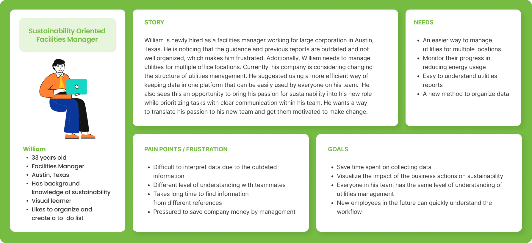
The user journey is based on our primary persona Camila's scenario:
As a small business owner, Camila has been looking for ways to lower her energy consumption as a way to invest in her community and lower her monthly costs. She already has purchased energy efficient appliances for her coffee shop locations, but is interested in understanding more about how her locations can lower costs and shrink their overall carbon footprint.
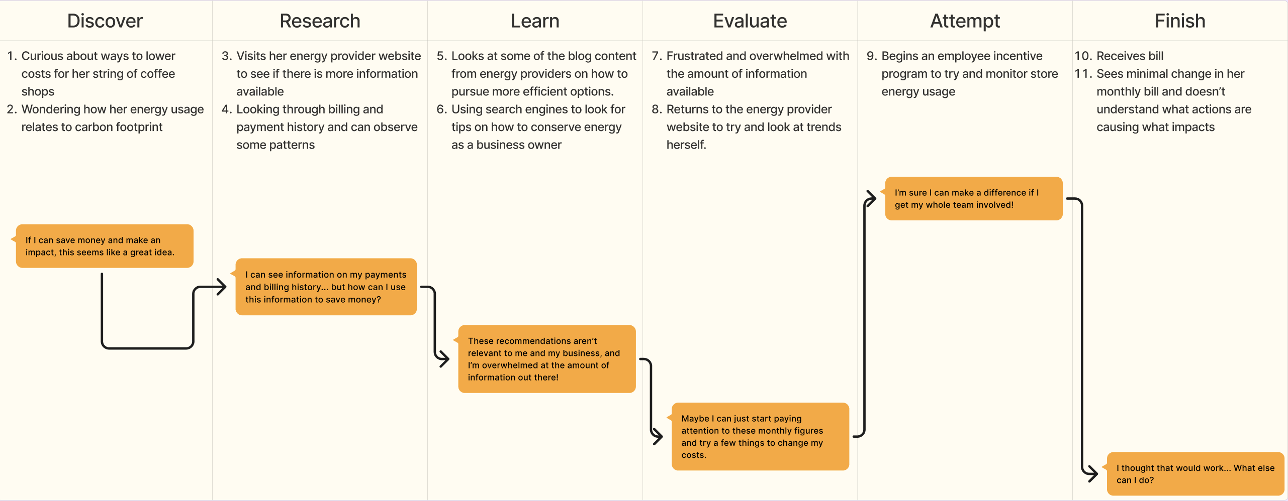
As a business owner, Camila needs relevant education to set and track sustainability goals because she wants to feel empowered to lower her company’s carbon footprint to be a responsible presence within her community.
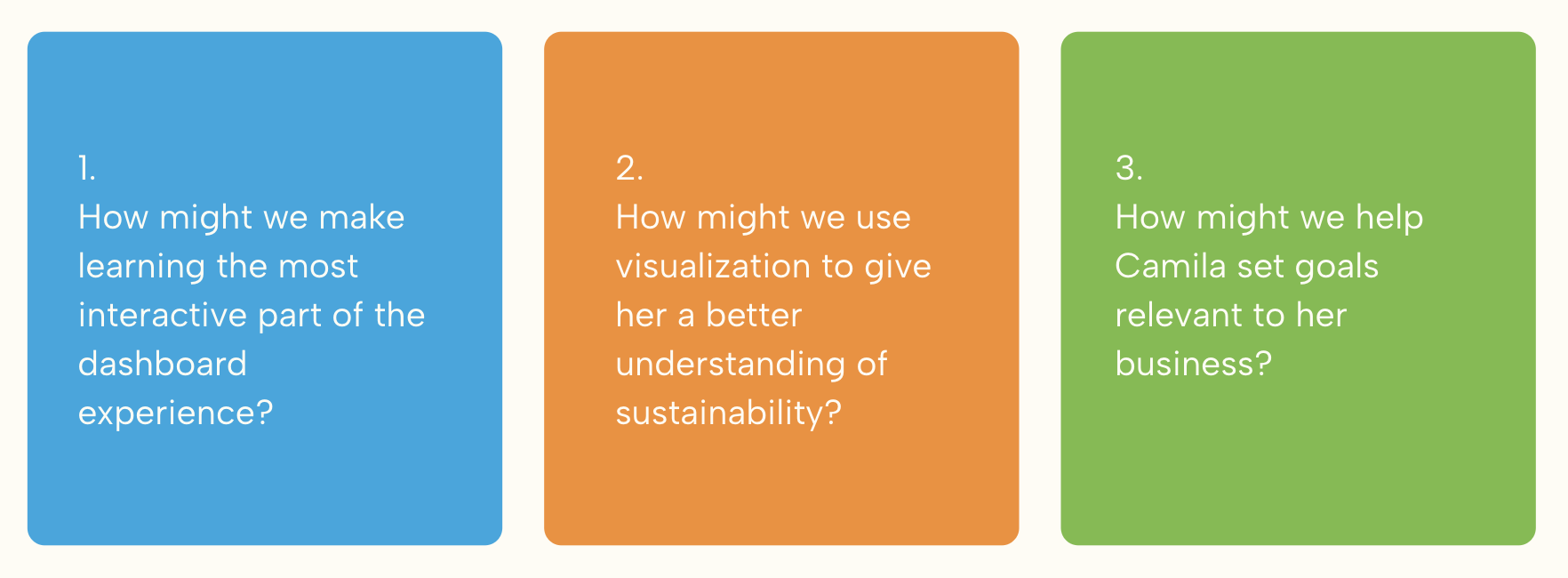
We ideated potential solutions with a focus on user engagement, visual support, and creating a connection between business and sustainability:
We created two user flows to illustrate different approaches to user engagement with new features:
Onboarding

Dashboard
This sitemap illustrates how the app is structured with the new features, which helps us to know where the content is located and whether it is easy for users to find the content.

Before starting wireframes, we had a design studio to brainstorm our ideas. We created iterations based on our HMW statements, and we were able to generate various design solutions and communicate with each other to move forward to the decision-making process.
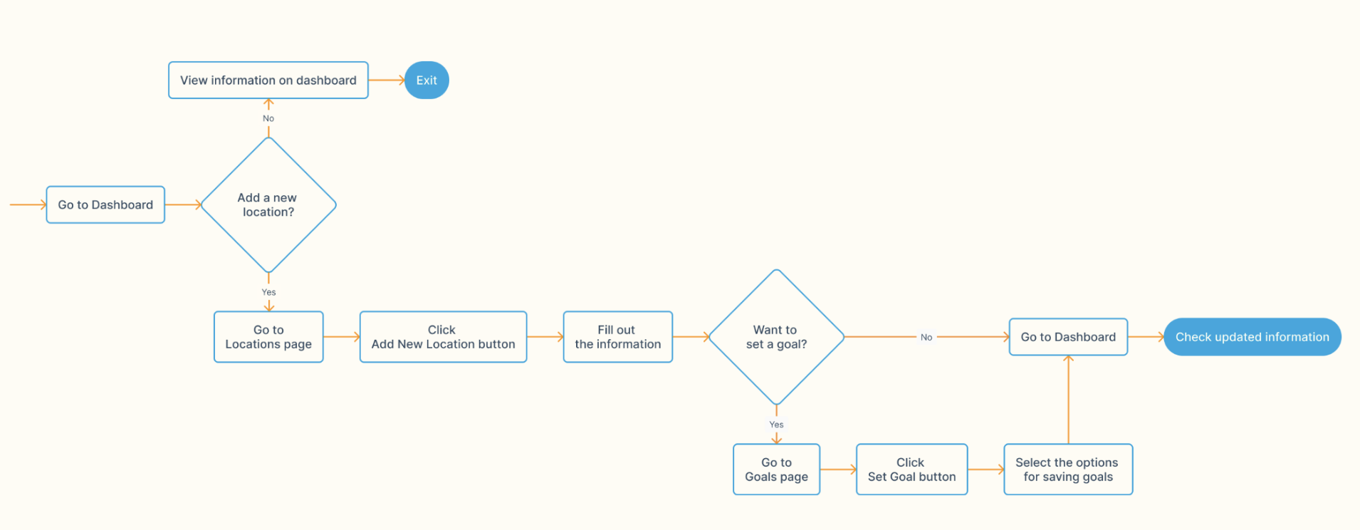
- Modular design for dashboard information: user can rearrange them by their preferences
- Inclusion of the mission statement on the onboarding screen: the user can get a better understanding of Enerwisely
- Goal setting screen on the navigation bar: the user can set more specific goals and keep track of the progress in detail