Typeface Design | Visual Identity | Specimen Book | Motion
03/2021
Ori is a geometric typeface inspired by paper folding. The name Ori, which means fold in Japanese, comes from the word “origami”.
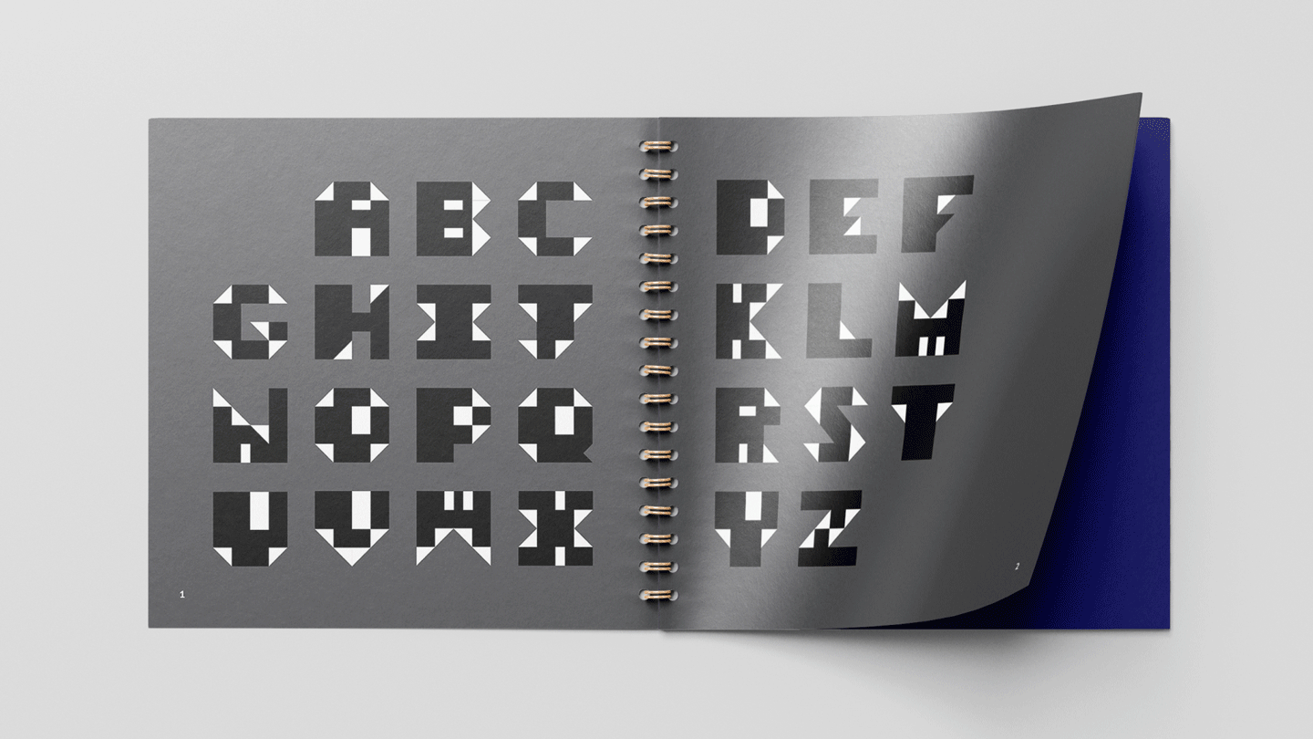
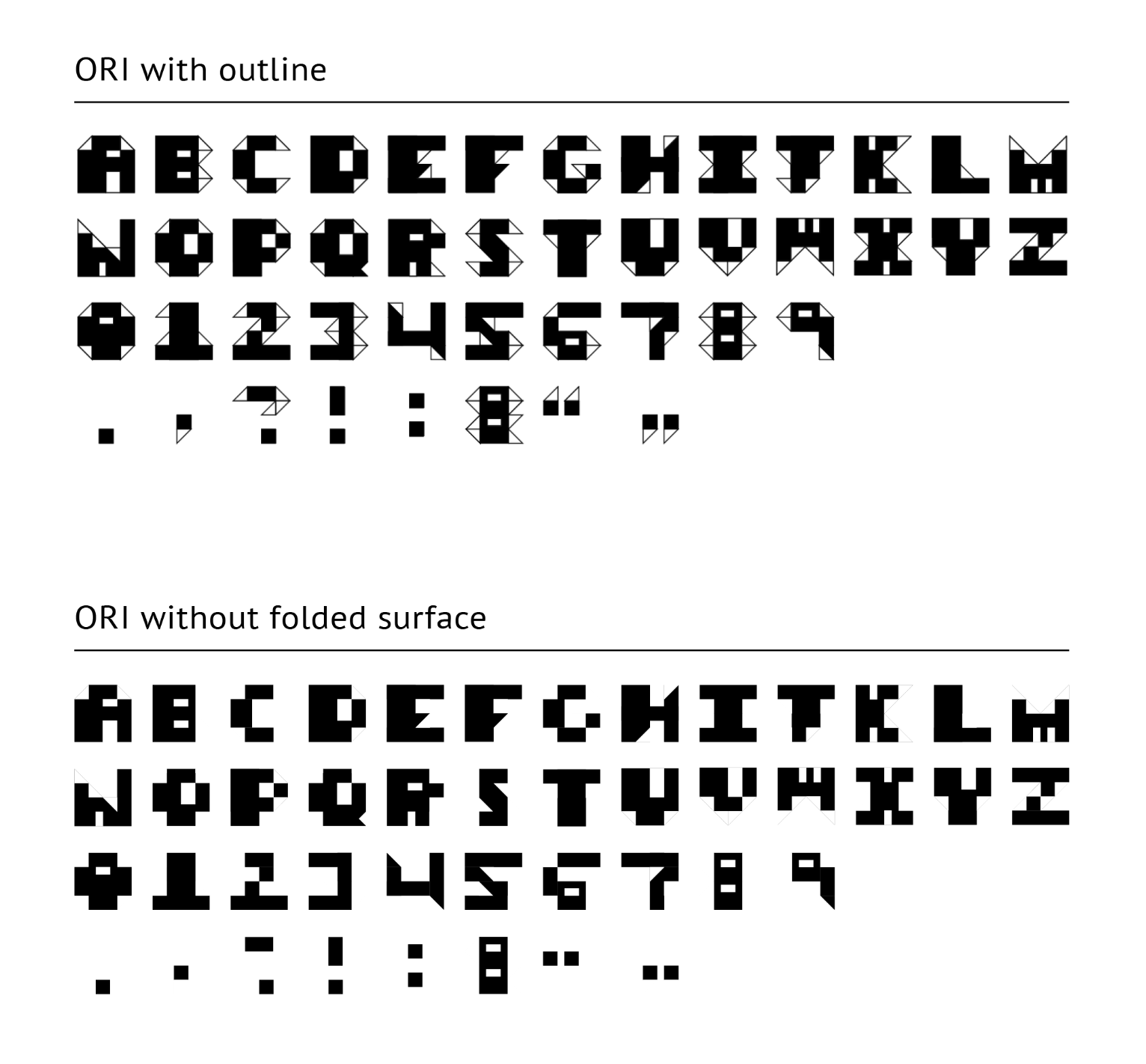
Ori is a geometric typeface inspired by paper folding. The name Ori, which means fold in Japanese, comes from the word origami. It consists of a grid system structured in square format from origami paper with diagonal fold lines. The letterforms are constructed from three geometric shapes: square for paper, isosceles right triangle for fold, and rectangle for counters. The relationship between these components creates a high contrast between thick and thin strokes. This typeface can be used for any format such as magazine or children’s book to create a systematic and playful feeling.
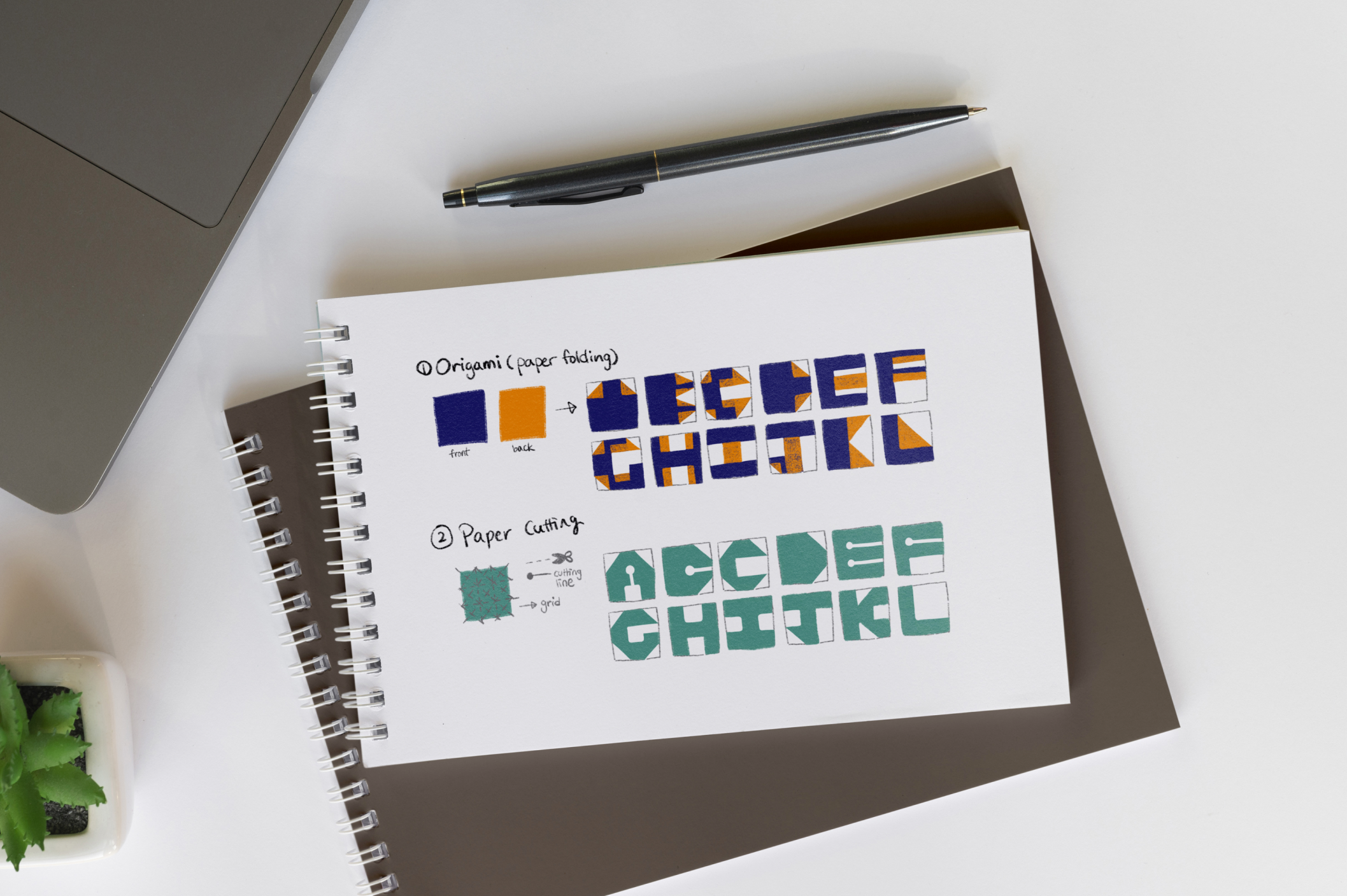
I started with two concepts (paper folding and paper cutting) and iterated the first concept. From the idea sketch below, I developed and simplified the shapes to make a consistent design. While I was making a specimen book, I decided to create a motion that represents the characteristic of this typeface.