Song Recognition App
08/2022
Role -> Design & Interaction Lead
Team -> Kayla Kwan, Connie Chen, Eric Wilkinson
The current Shazam app is only known for identifying a song. Our team improved user interaction within the app by adding new features for customizing and sharing songs discovered through Shazam.


Enhance user engagement with Shazam to increase the amount of time users spend on the app and maintain the number of returning users.
We began with mind maps and various types of research including heuristic evaluation, user interviews, competitive & comparative analysis (task analysis, feature inventory pluses & deltas), and secondary research.
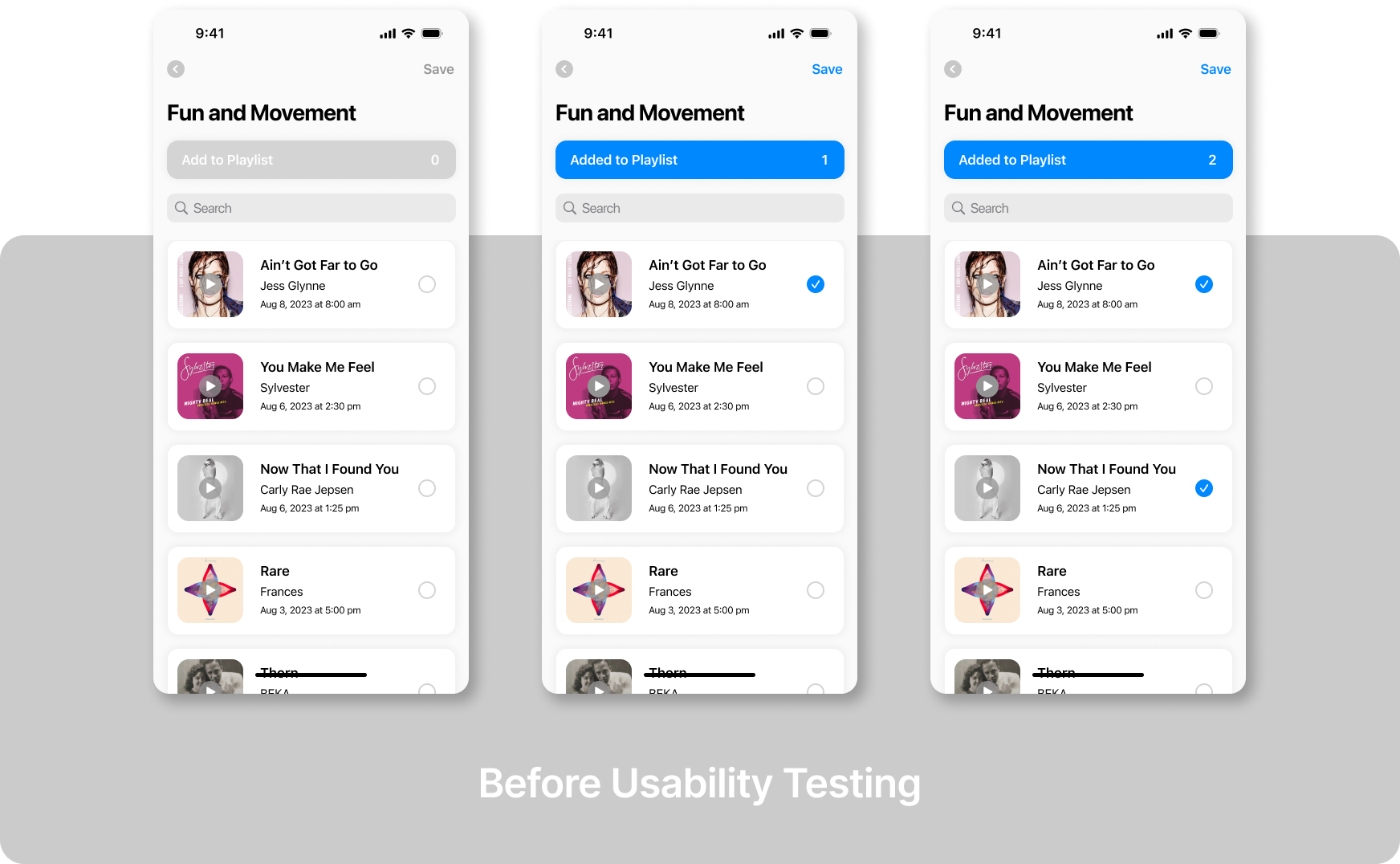
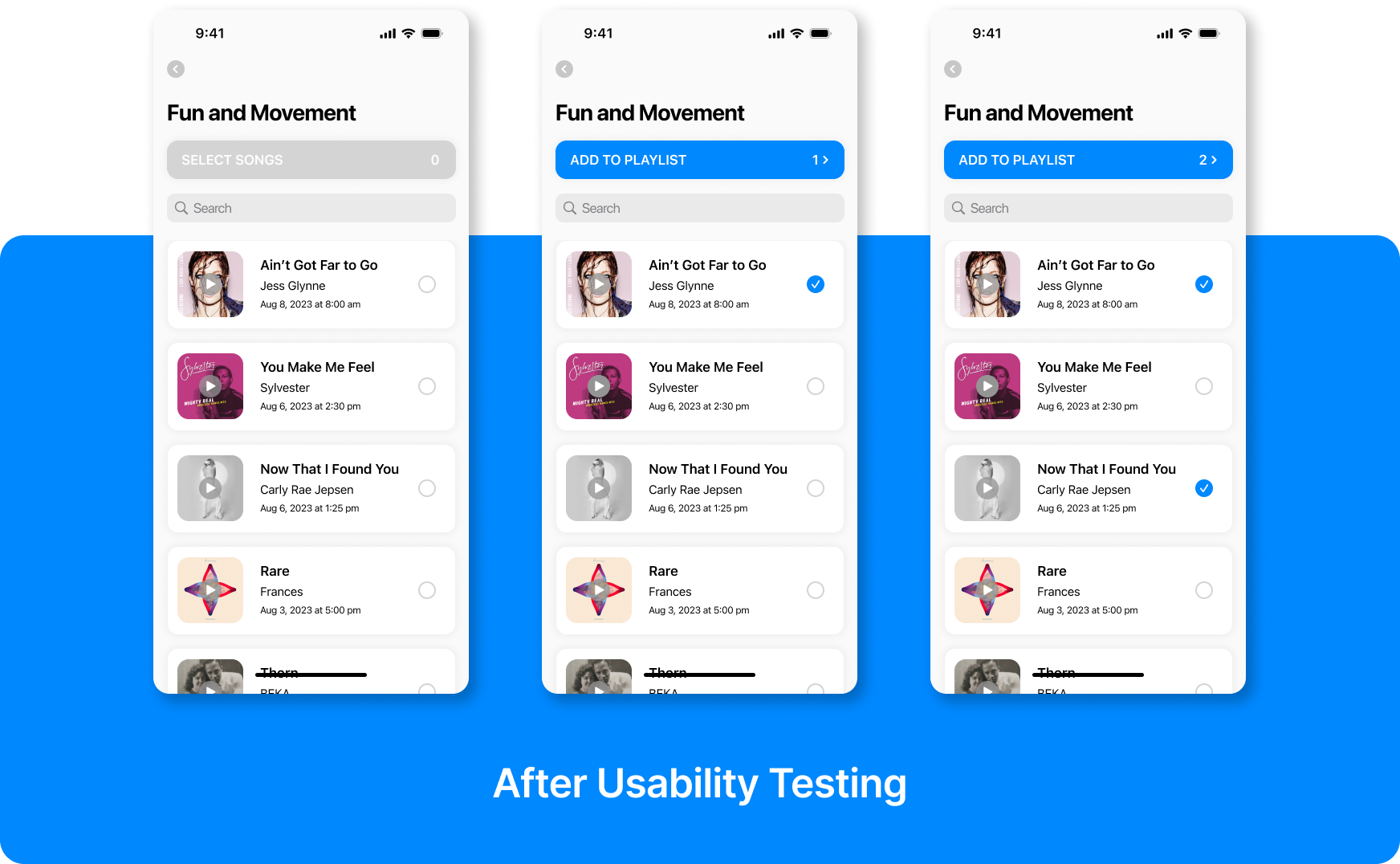
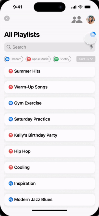
During the heuristic evaluation, we assessed the capabilities of the current Shazam app and prioritized the severity levels of the usability issues. One of the significant usability violations identified was that the current app is limited to a single playlist with no customization. Additionally, there are inefficient flows that are repetitive or require the user to take multiple steps to complete the task. This heuristic evaluation helped us to identify several issues with the current app that might cause users to be unsatisfied with the app.
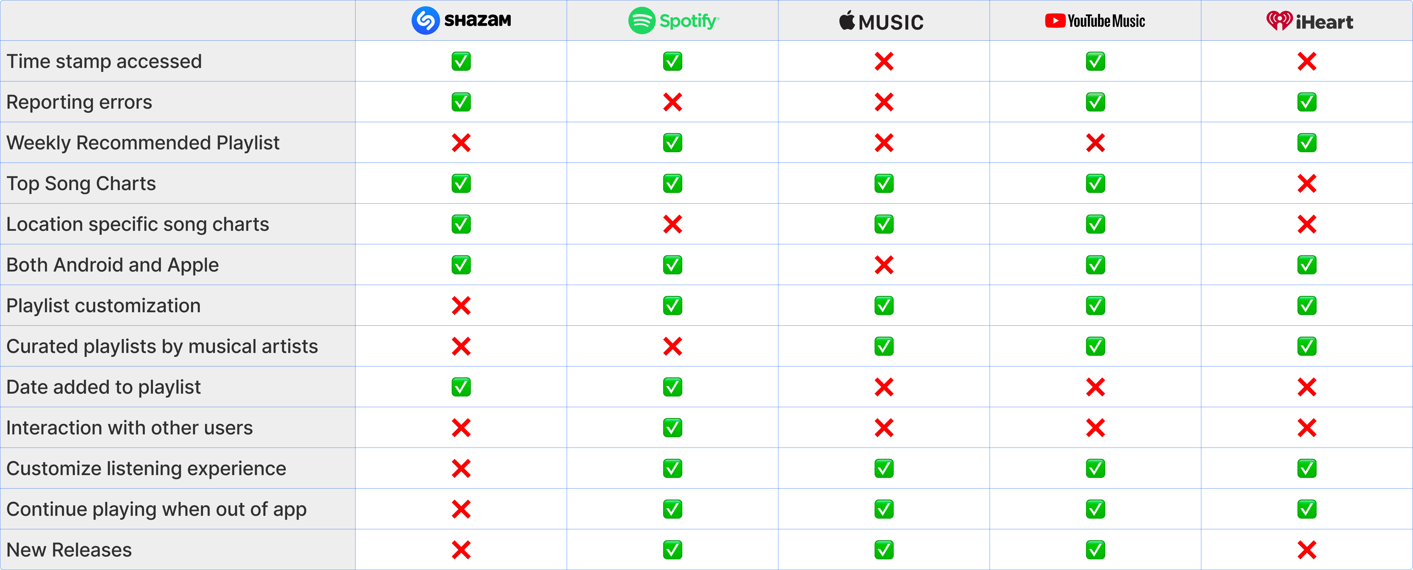
Competitors from Music Industry:
- Spotify
- Apple Music
- Youtube Music
- iHeart Radio
Feature Inventory:
We discovered that these apps offer customization and personalized options for each user. However, they lack an efficient method for sharing multiple songs with individuals who use different streaming platforms.
It requires users to share their songs through an external link to get the song information and manually add to it their playlists.
Comparators (area of sharing and interaction):
- Facebook Memories
- Google Photos
- Instagram Story
Pluses and Deltas:
These insights cover the strengths and weaknesses of each app, allowing us to identify areas for improvement and differentiate the Shazam app from others.
We learned that these apps allow users to share their content with other users in multiple formats and choose the level of visibility to the public feed.
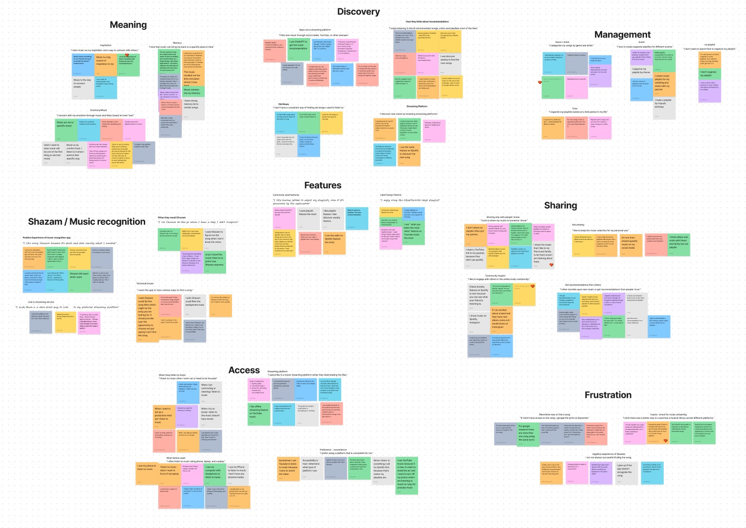
From user interviews, we were able to identify user’s behaviors, needs, and frustrations and also gained insights into various perspectives of their interactions with music including listening, sharing, and collecting.
"It feels like I can relate to the people who listen to the same music as me.”
"I used to spend a lot of time organizing music, but it’s too time consuming."
"I share the music that I like with my friends and family to let them know I am thinking about them."

* Interview Questions Brainstorm
From user interviews, we were able to identify user’s behaviors, needs, and frustrations and also gained insights into various perspectives of their interactions with music including listening, sharing, and collecting.
"I view music as my inspiration and a way to connect with others."
"I don’t want to spend a lot of time organizing my playlist."
"I like having options to adjust my playlists, even if it’s generatedby the application."
* Interview Questions Brainstorm
From the user interviews and affinity mapping, we have noticed that the users are facing these problems:
- Users think it is inefficient to spend time organizing their songs.
- Users weren’t aware of syncing music streaming app feature.
- Users are likely get connected with other people and share their music experiences.
- Some users think organizing playlists is time-consuming and overwhelming.
- Users easily share their songs with others who are using the same music streaming apps but use social media to share with others who are using different platforms.
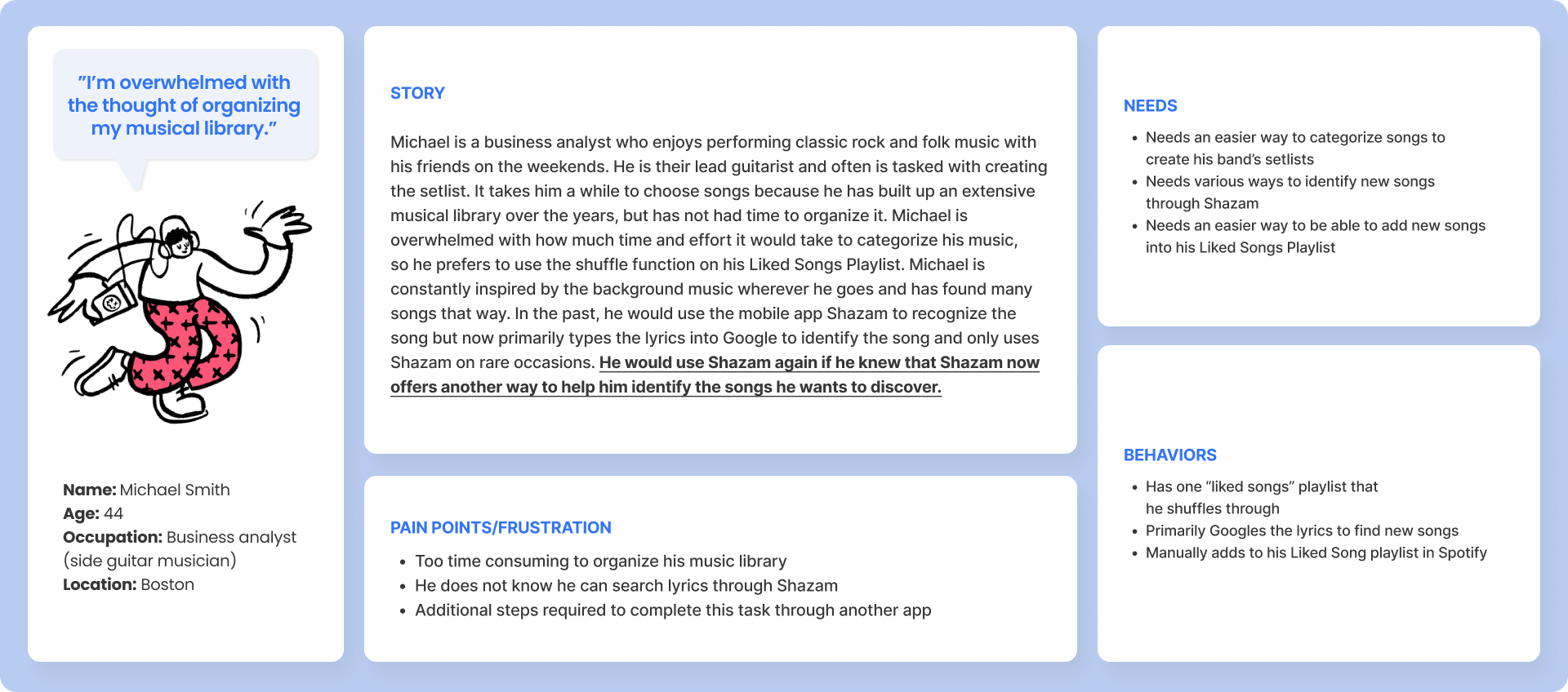
Based on the insights from the research, we created two user personas to empathize with pain points, needs, and behaviors.
Both Amanda and Michael are looking for a more efficient way to create their music. Additionally, Amanda additionally wants a sharing option with other users across different music streaming apps.
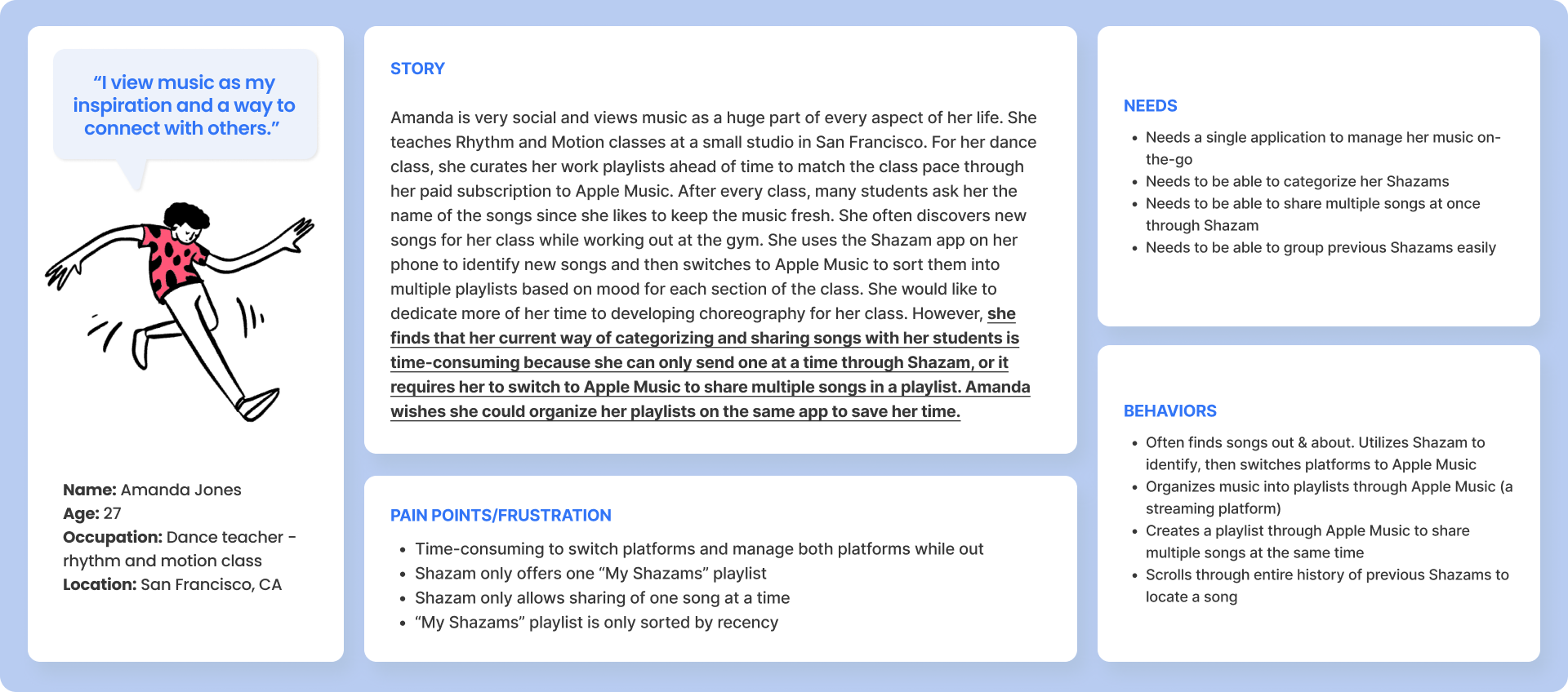
The user journey is based on our primary persona Amanda’s scenario.
If she doesn’t have an easy way to manage and share her discovered songs within the Shazam app, then she will leave the app once she finds a song with the song recognition feature.
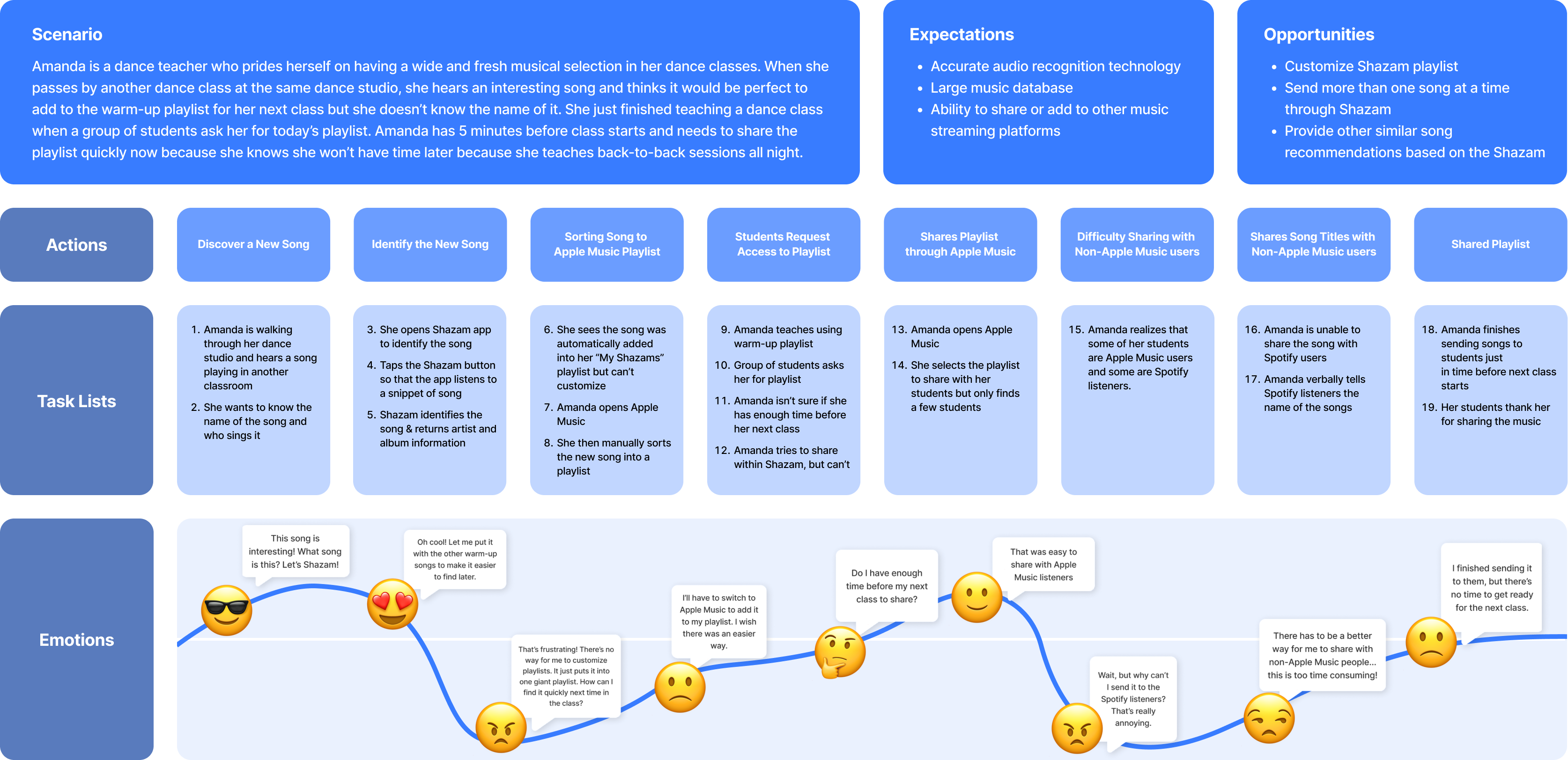
Shazam Amanda, a private dance instructor, needs an efficient way to sort a song she just discovered because she wants to curate and share new music with her students to keep her classes interesting.
We began exploring potential solutions for our problem statement with these HMW statements:
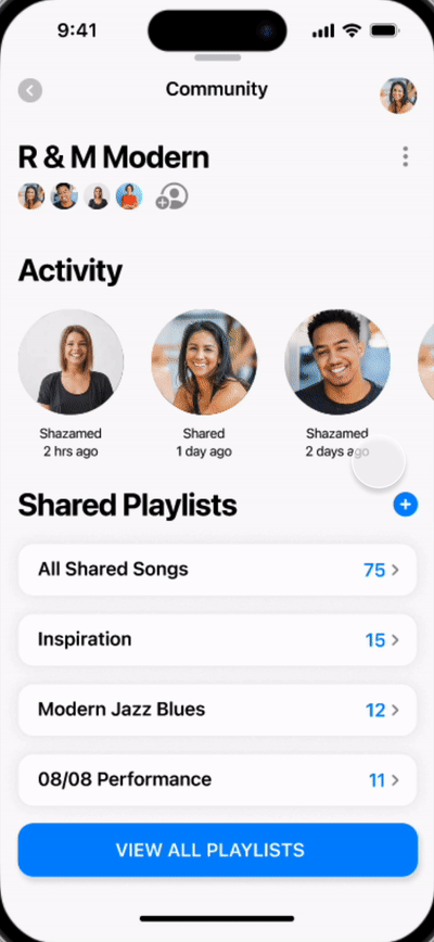
- How might we make Shazam more interactive with other users?
- How might we bring more fun to users besides recognizing the song?
- How might we let users access their current playlists from other platforms?
- How might we allow users to customize their own playlists?
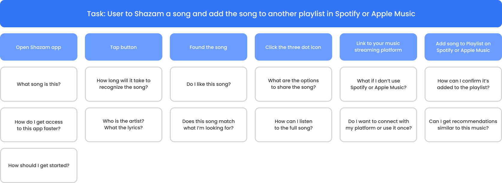
We created two user flows to illustrate different approaches to user engagement with new features:
Discovering a Song and Adding It to Playlists

Sharing Songs with Other Users

These user flows are based on the same scenario from our primary persona so we can see how these new features can improve the capabilities of the app and create more interaction experiences within the app.
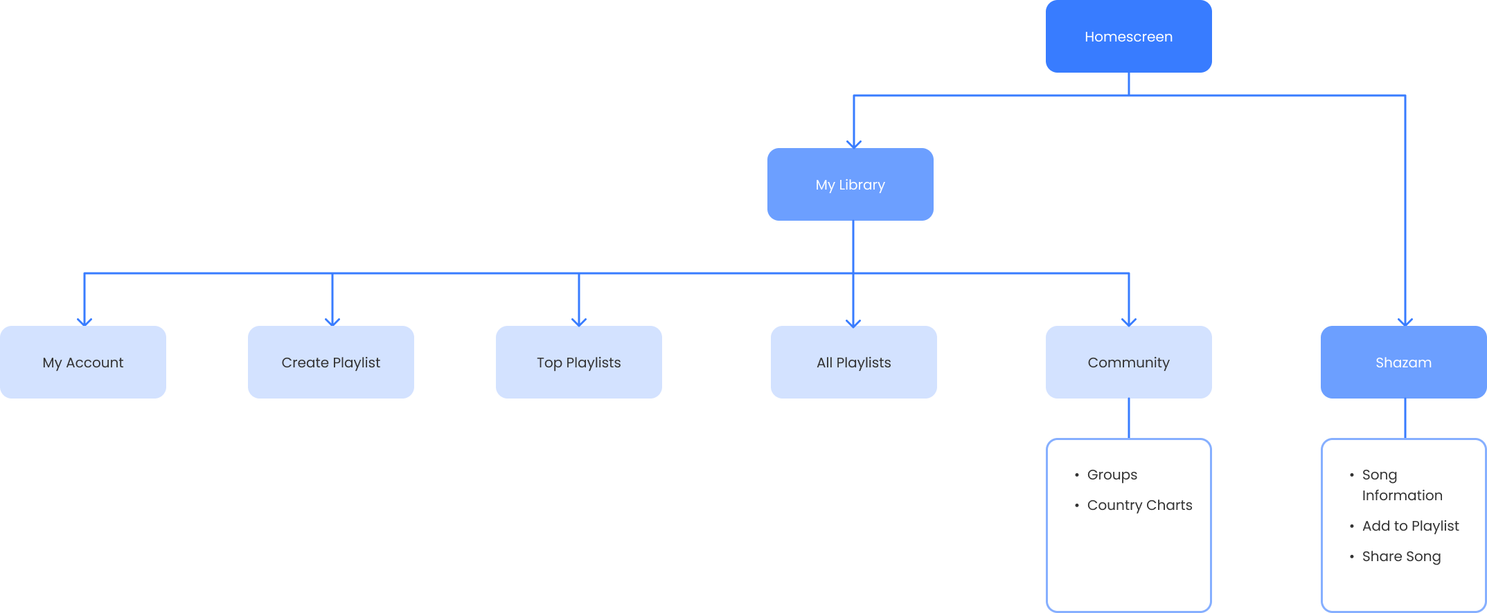
This sitemap illustrates how the app is structured with the new features, which helps us to know where the content is located and whether it is easy for users to find the content.
Before creating wireframes, we spent time sketching wireflows individually and shared our ideations as a team. During this process, we were able to highlight areas to focus on. As the Design Lead, I was responsible for creating digital wireframes that reflect our discussion and feedback from the team. We began with lo-fi wireframes and gradually added fidelity so that we can see if the structure and flow makes sense before adding any content. It helped us to visually communicate and iterate ideas.